Aims
To redesign the with an emphasis on intuitive navigation and visually appealing elements to meet the needs of users and in turn increase subscriptions
Audience
Targeted health-conscious individuals, including busy professionals and families, looking for convenient and customisable snack options.
Apps
Figma.
Project Overview
How can we simplify the process of creating a Graze subscription account for new visitors landing on the site? The goal is to clearly communicate the value of Graze’s services while making the sign-up process seamless, intuitive, and compelling for first-time users
Research & Discovery
Design Process
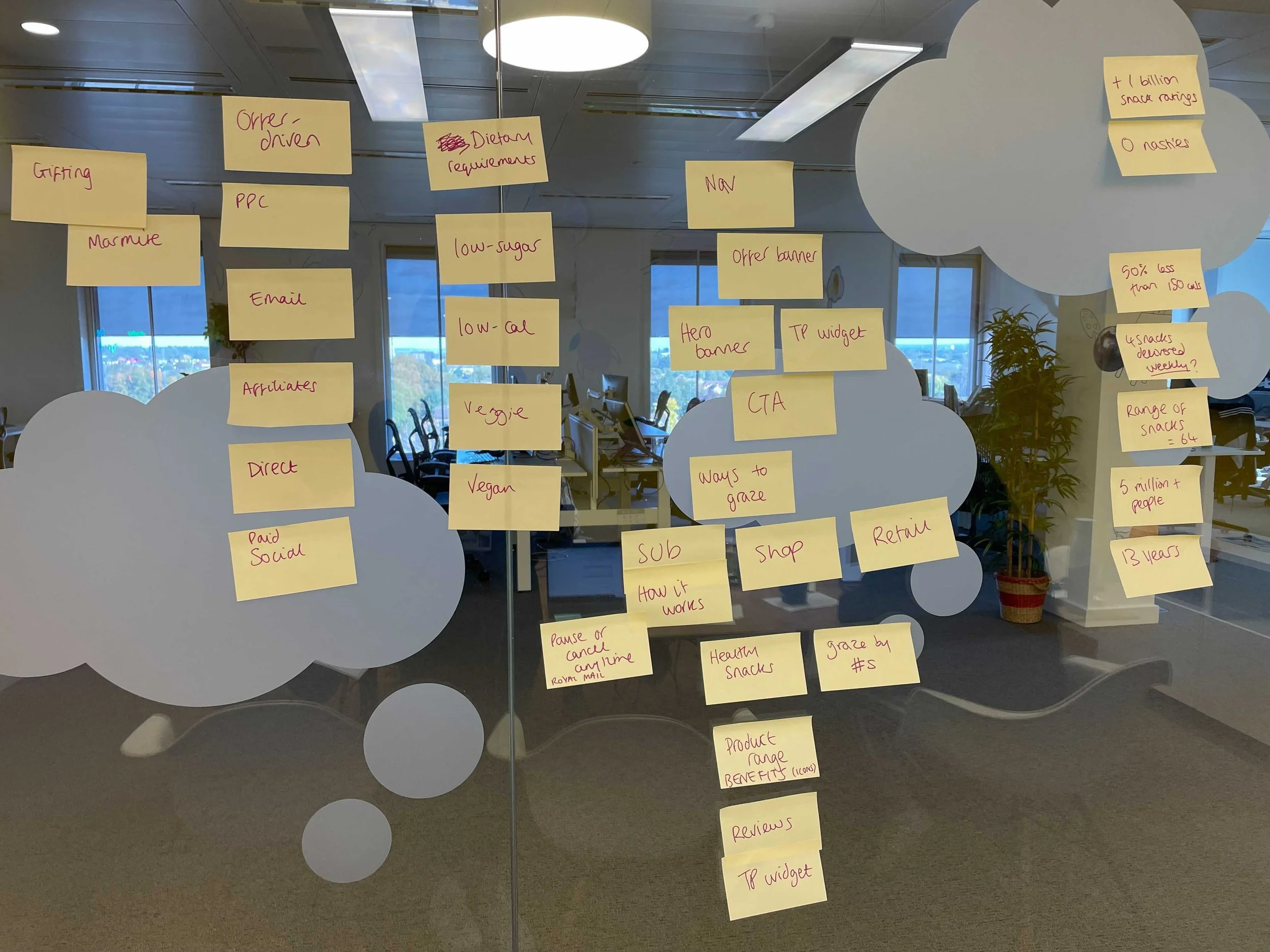
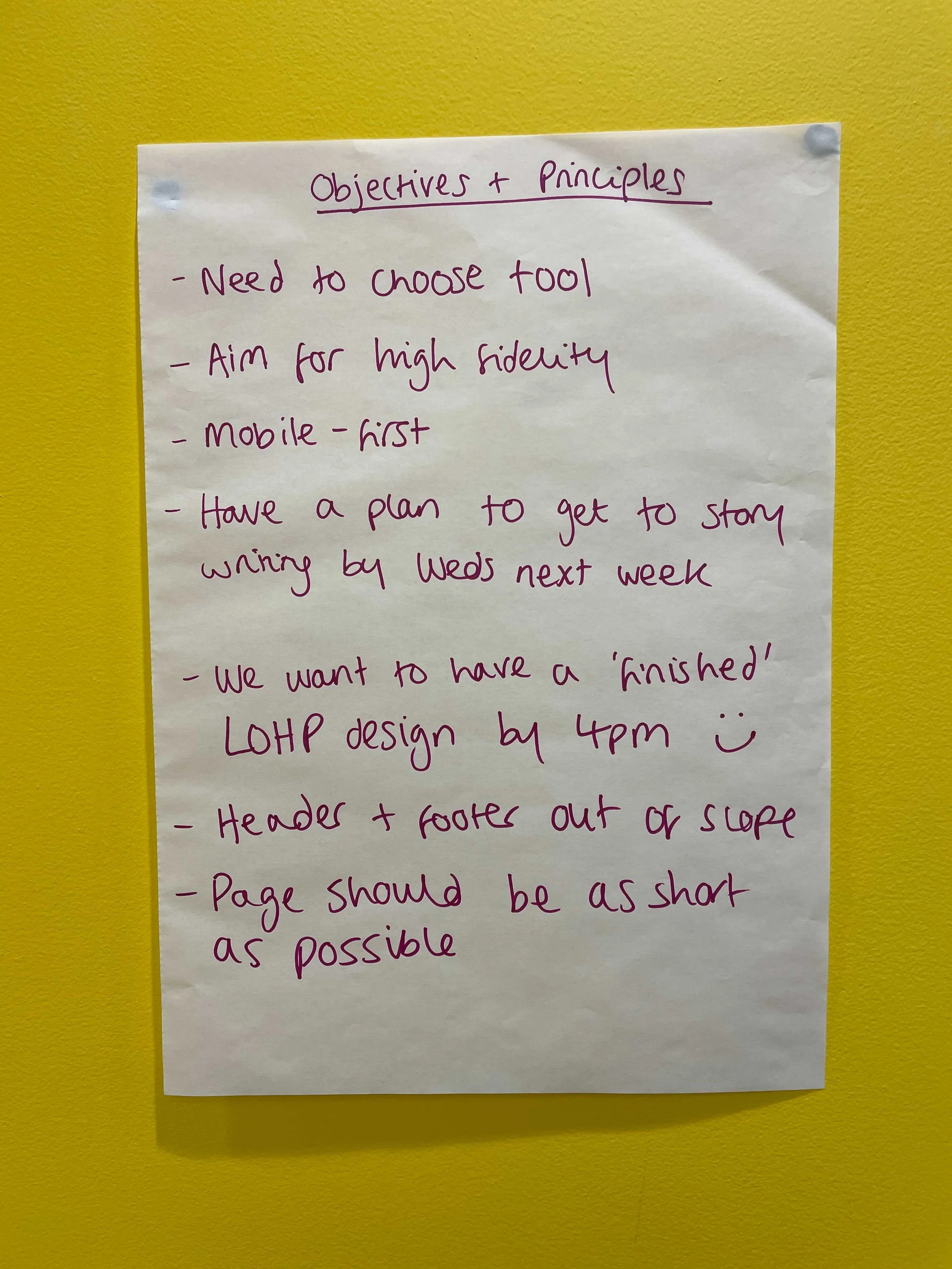
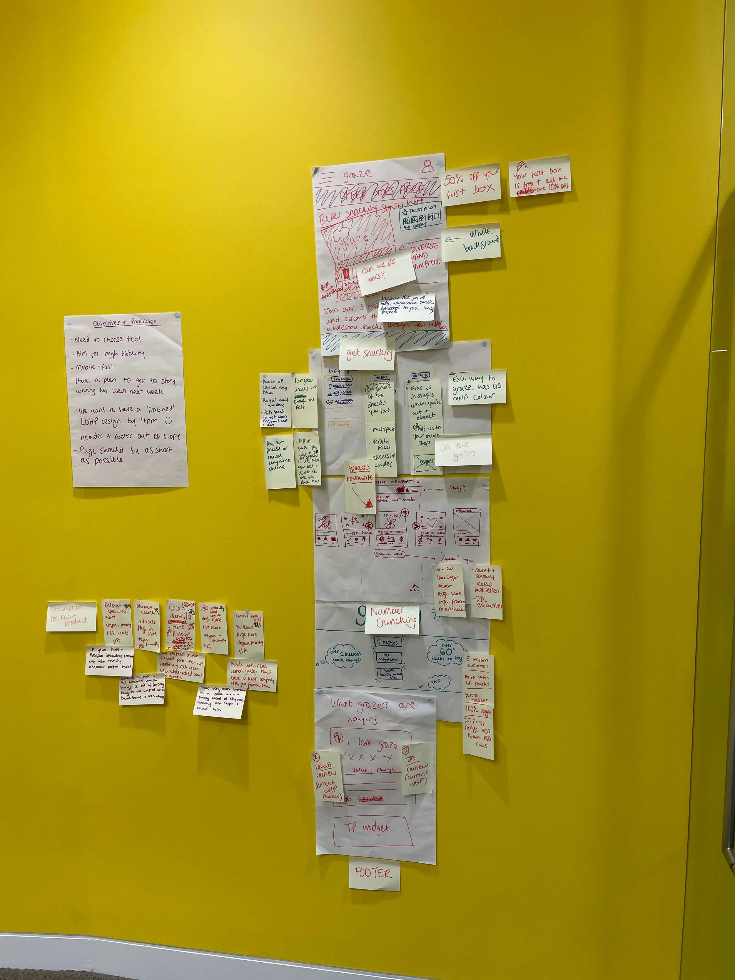
During the planning phase, we identified key user goals: understanding the value of subscription benefits, navigating the site easily, and feeling confident in choosing a personalised snack box. Insights from research emphasised the importance of clear visuals, concise messaging, and prominent calls to action.
User Testing
(Early Hi-Fi Version)
User testing of the early high-fidelity prototype revealed pain points in navigation and functionality. Users found the flow slightly complex, and some CTAs were not immediately intuitive. These insights drove refinements to ensure a smoother, more engaging experience in the final design.
“Its too colourful”
“The benefits weren’t clear right away.”
UI Branding Elements
Typography
Sofia Pro continues Graze's approachable and playful tone.
As per the brand's style guidelines, headers were intentionally designed in lowercase to convey a casual, friendly feel while maintaining readability.
Interactive Elements
Demonstrated button states to ensure consistency and clear feedback across interactions.
This attention to detail supports intuitive navigation and reinforces the platform’s ease of use.
Colour Palette
Because of the brands wide colour scheme, its was meticulously tested and adapted to meet accessibility standards, ensuring legal compliance and an inclusive experience for all users.
Custom Icons
Designed a suite of icons using the brand's colour palette to visually communicate the unique selling points of Graze snacks.
Icons were tailored to represent snack features such as “high in fibre,” enhancing the user's understanding at a glance.
High-Fidelity Wireframe
Based on testing insights, the final design yielded significant improvements in clarity and usability. Key enhancements encompassed the optimisation of navigation, providing users with a linear narrative that accentuates subscription value through prominent brand visuals, and integrating user-friendly micro-interactions to facilitate an intuitive user experience.
Results*
25% increase in subscription sign-ups within the first month of launch.
User engagement time improved by 15% due to clearer navigation.
85% of surveyed users rated the process as “very easy.”
*Simulated results used to ensure privacy.
Reflections
This project reinforced the value of user-centred design and iterative feedback. By focusing on the needs and behaviours of first-time users, we delivered a solution that combined clarity, simplicity, and engagement. Future improvements could include integrating personalised recommendations earlier in the user journey.


